| |
FLTK Widgets
|
FLTK includes all of the usual widgets to develop your
applications, and new widgets can be created easily through C++
subclassing. All widgets support keyboard shortcuts and can be
controlled both via the keyboard or mouse.
The Fl_Button class supports push, check (Fl_Check_Button), round
(Fl_Round_Button), and "light" (Fl_Light_Button) button styles;
all styles can operate in momentary (press and release),
toggle (press on, press off), or radio (press one of many) modes, so it is
possible to create almost any kind of button from a single widget.
The Fl_Input_, Fl_Text_Display, and Fl_Help_View widgets
provide simple to complex text input and output facilities.
The Fl_Text_Display widget is based on a C++ version
of the NEdit software's extensible text editor API.
The Fl_Valuator class
provides a variety of numeric input controls including
scrollbars (Fl_Scrollbar) and sliders (Fl_Slider).
The Fl_Menu_ class provides several menu-based controls
including menubars (Fl_Menu_Bar)
and combo boxes (Fl_Choice).
The Fl_Browser_ class is the basis for list controls.
The Fl_Browser widget shown at right lists lines of plain text.
Other widgets list files, widgets, and so forth.
User interfaces can be organized using scroll areas
(Fl_Scroll), tabs (Fl_Tabs), tiles (Fl_Tile), and wizards
(Fl_Wizard).
FLTK also provides standard dialogs for alerts, button
choosers, color choosers, file choosers, help browsers,
messages, passwords, and text input.
Finally, FLTK 1.1.x offers two appearance schemes: "standard"
and "plastic", and 1.3.x includes two additional schemes "gtk+"
and "gleam".
Colors and fonts automatically adjust to the current user preferences.
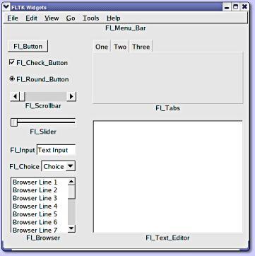
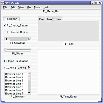
 FLTK Widgets w/GTK+ Scheme
|
|
 FLTK Widgets w/Standard Scheme
 FLTK Widgets w/Plastic Scheme
|
Fast Light User-Interface Designer (FLUID)
FLUID allows you to develop complex applications quickly.
You can build complete applications within FLUID, drawing your
user-interface and creating functions, classes, and variables
as needed.
FLUID creates C++ source and header files that can be
compiled by themselves or included as part of a larger project.
In fact, several of the FLTK dialog widgets were created and are
maintained using FLUID.
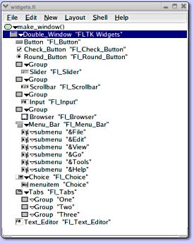
The main FLUID window (at right) shows the widget browser along
with any classes, functions, and variables you have. You can
create simple user-interfaces using a function and global widget
variables or define C++ classes for a fully encapsulated
user-interface.
 FLUID Widget Bin
|
|
 FLUID Window for Sample Widgets Above
|
|
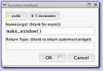
New items in the widget browser are added via pop-up menus
or the widget bin (above) and can be placed in windows by
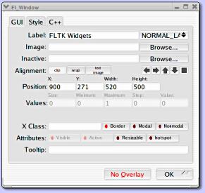
clicking and dragging. Each widget's attributes are controlled
through the widget attribute panel (right). Class, function, and
variable definitions are created using simple dialogs like the
one below:
 FLUID Function/Method Dialog
| |
 FLUID Widget Attribute Panel
|
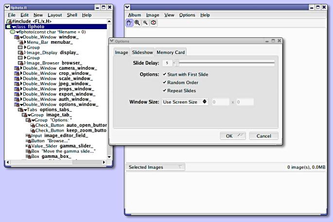
The flPhoto user-interface was done completely
with FLUID and is pictured below.
 FLUID w/flPhoto Project
|
| |

